Corporate Social Responsibility
Evolving Microsoft's Corporate Social Responsibility story into a single, dynamic, mobile-first experience
An experience was created that enhances the storytelling and data visualization of Microsoft's Corporate Social Responsibility. A dense PDF was transformed into a well organized website, which focuses on using flexible content modules so users can self-select the type and depth of information they seek. I worked as one of two UX Designers and Content Strategists.

My Role
UX/UI Designer, Visual Designer, Content strategist
Timeline
4 months
Team
Myself, 1 Senior UX Designer, Illustrator

Problem
The old website used a dated design and lacked a consistent UX and visual structure. We were tasked with transferring a printable PDF into web format, while preserving the content's authenticity.
Project Goals
Demonstrate Microsoft’s leadership in innovation and reinforce key brand attributes by delivering a humanizing, connected, and intelligent display of information. Present the CSR story in a rich, dynamic, and interactive fashion, creating an interesting and engaging experience for all audiences.
Process
Worked closely with the two stakeholders while designing to ensure all necessary content was represented. Partnered with an illustrator to bring to life each “chapter”.
Personas & Target Audience

The CSR Analyst
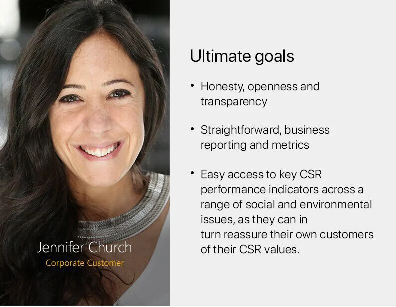
The Corporate Customer

The General CSR Enthusiast
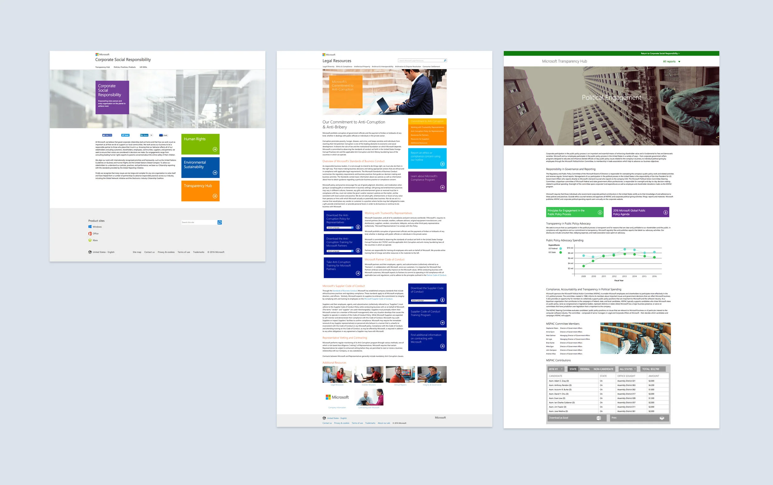
Old Design
The old website used a dated design and lacked a consistent UX and visual structure. CTA’s are only used in the right and left rails of the pages and there is a lot of text.
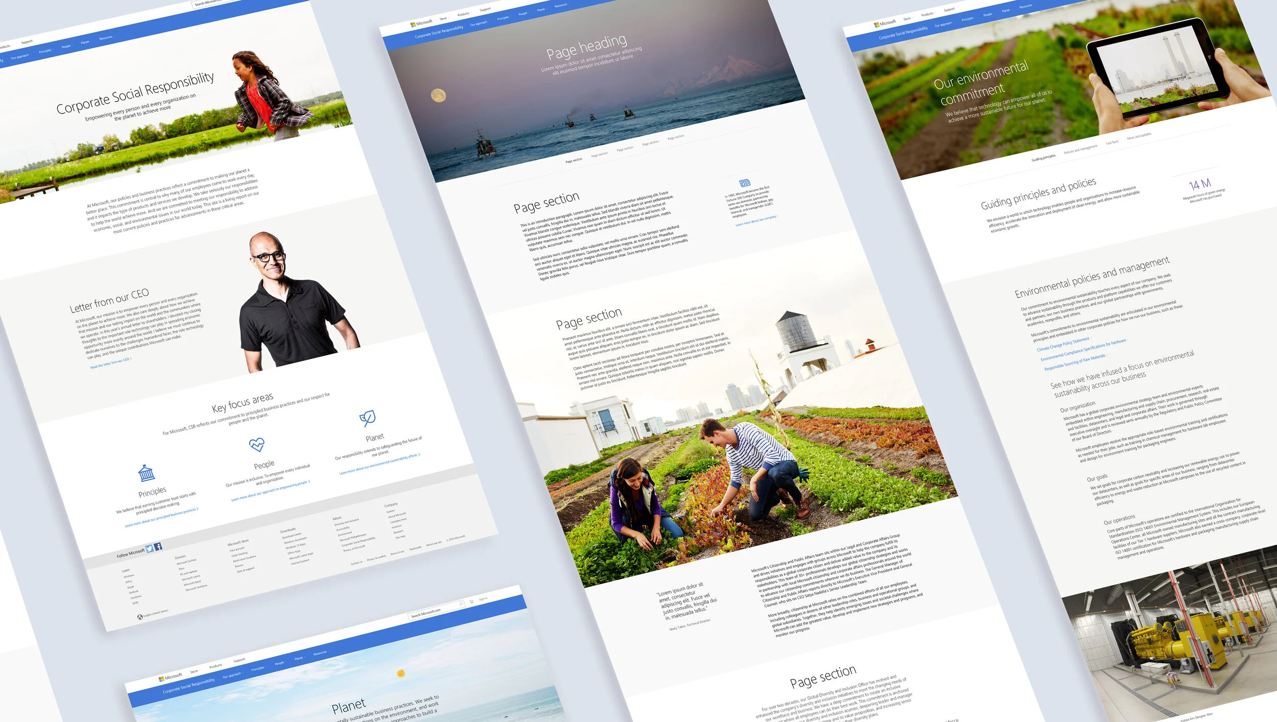
New Design
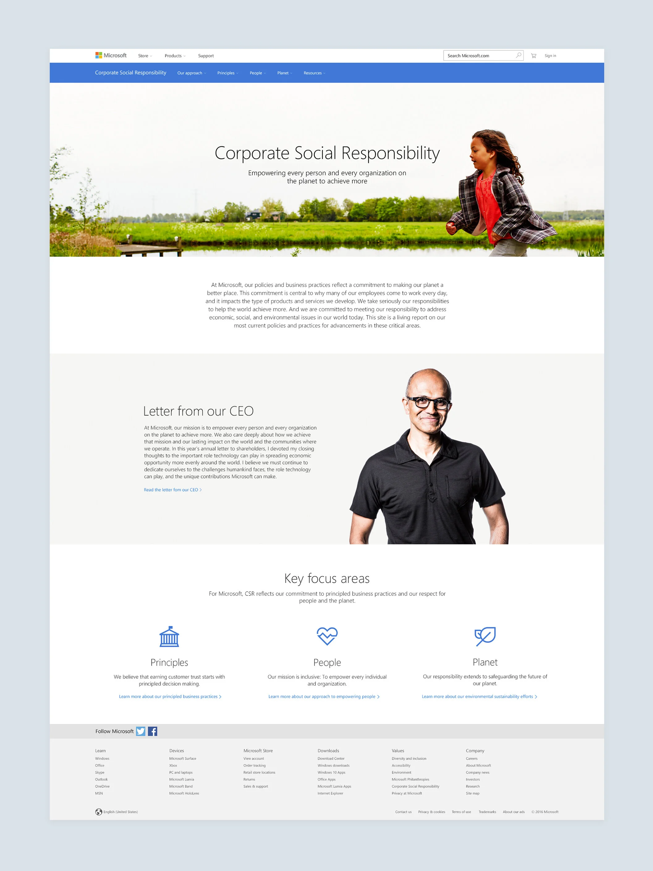
The new design focused on visual representation of data as well as important content. The content was organized into Landing pages and Issues pages. In-page navigation is used on each Issues page to provide the users with a straight forward information architecture. Flexible content modules are used to ensure the page is appealing to all three types of users.
Old vs New

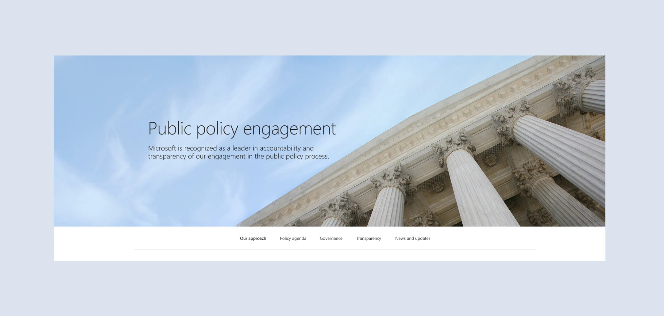
In-Page Navigation to Find Content
The new site is organized by category. Each category has a landing page that directs the user to an Issues page, which then has an in-page navigation directly below the hero image, functioning as "chapters" within each category. This proved to be the best approach to organize the complicated information architecture of the site.
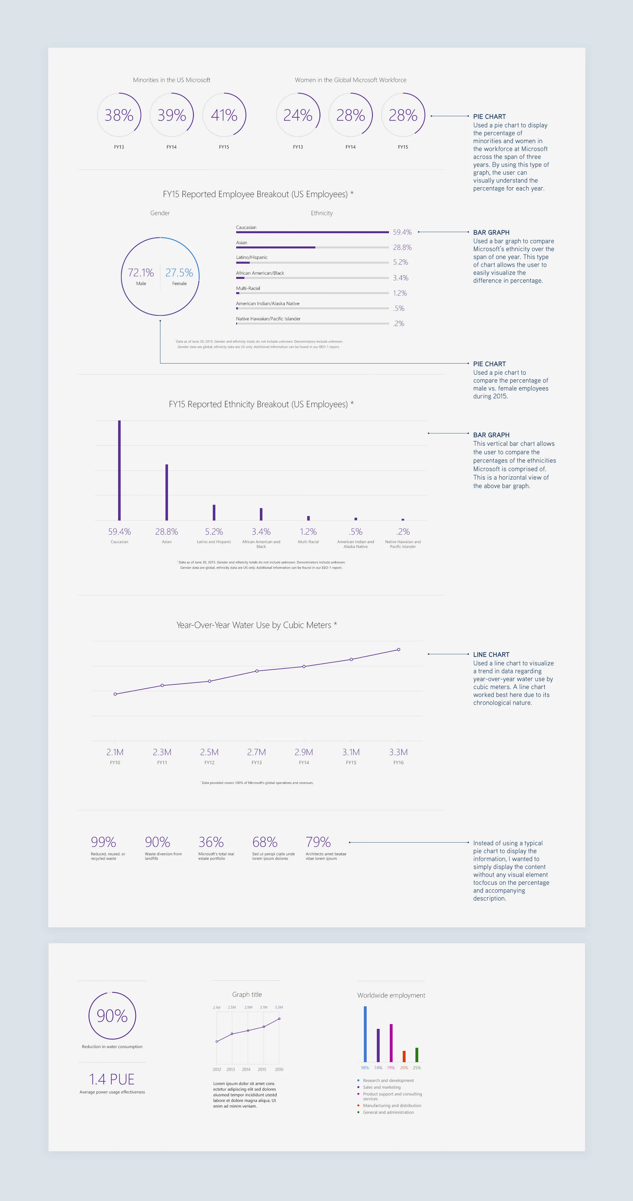
Data Visualizations
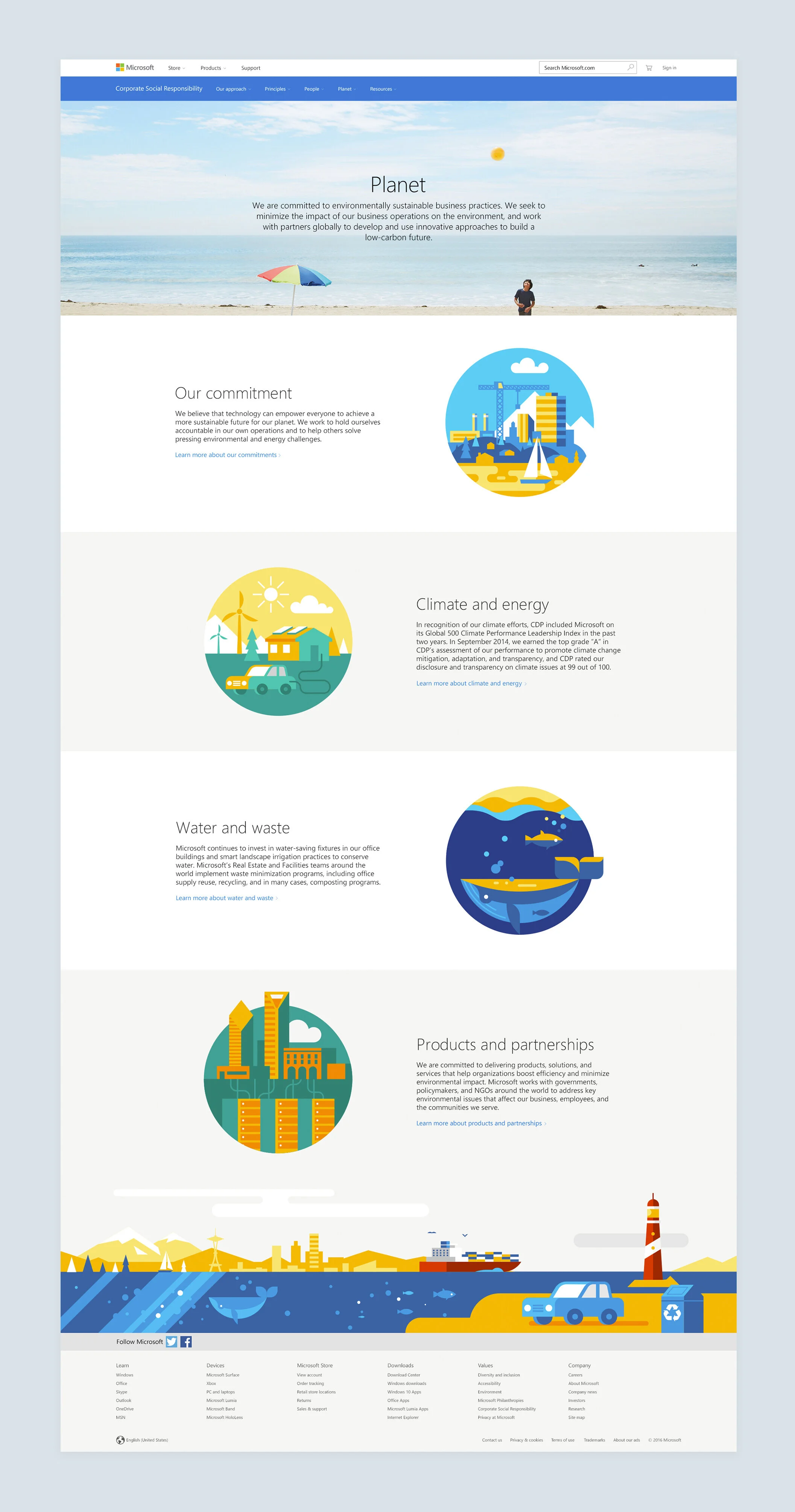
Issues Page Template
The issues template, comprised of flexible modules, was created to showcase all modules on a single page. By creating these modules, the user can self-select the type and depth of information they seek. It also proved successful when handing off to the developers.
