Heavenly Ski Resort
A ski resort homepage that has everything
As an avid skier, I wanted to create a homepage that gives the customer the specific information they want to find. The goal of this case study was to create a website that is clear in its information hierarchy and culture, while providing the users with an overview of the resort.

My Role
Creative Director, UX/UI Designer, Visual Designer, Content strategist
Timeline
3 weeks
Client
Case study


The Problem
The current website does not have a clear heirarchy and does not highlight what most users come to the site for: tickets, lodging, and events.


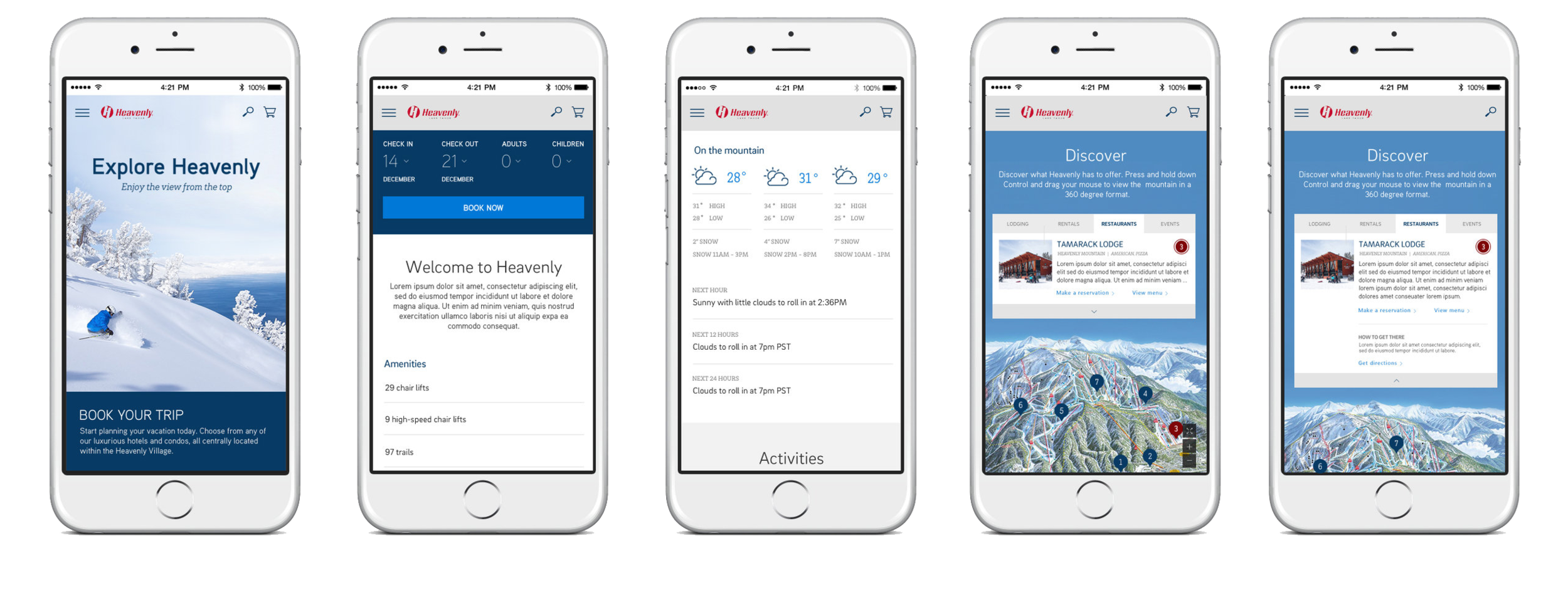
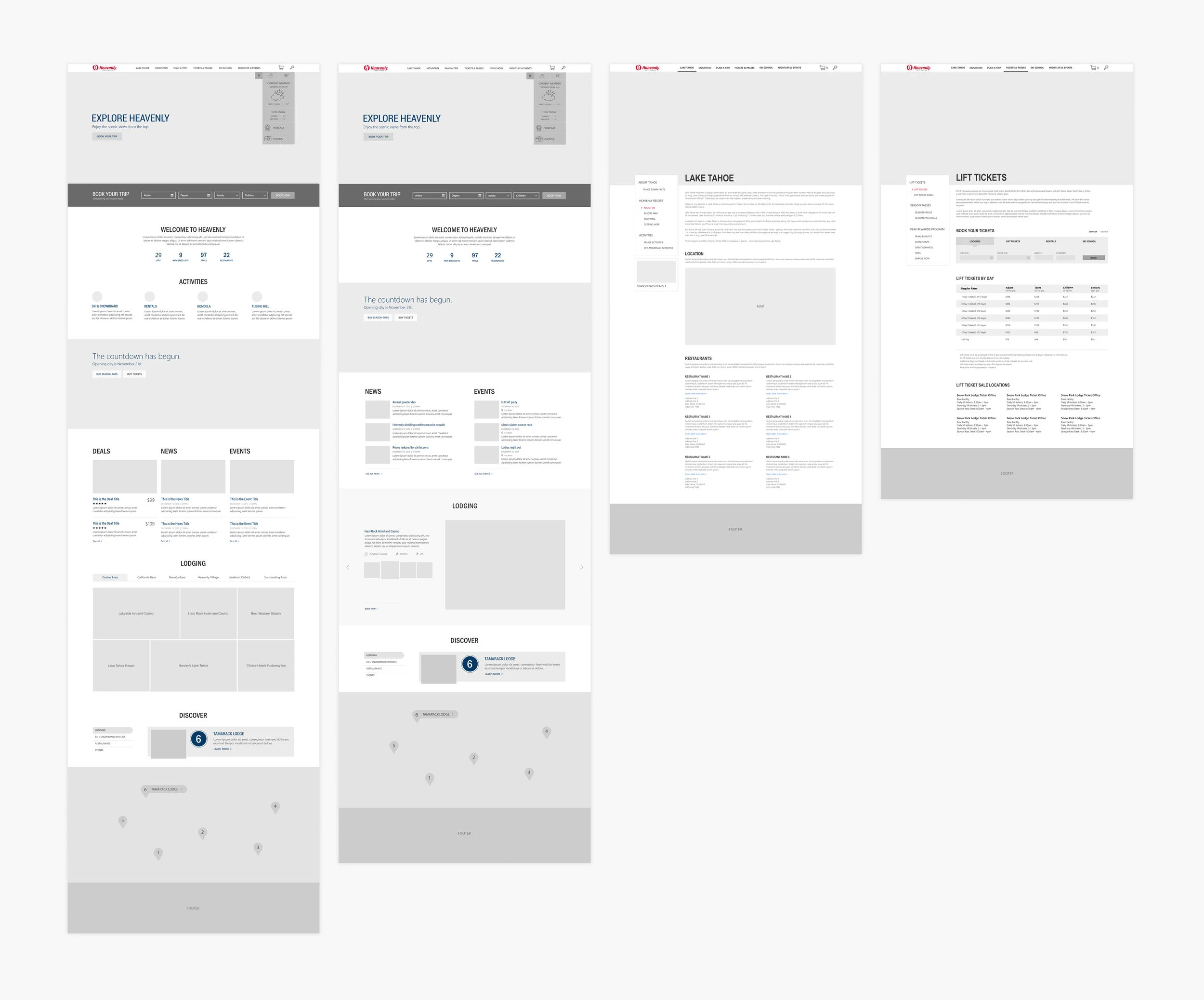
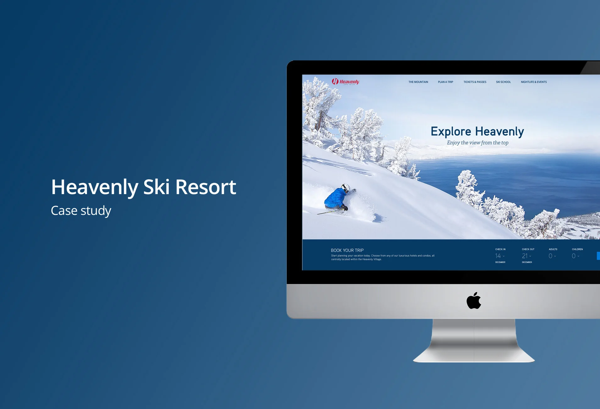
Above the Fold Design
The design above the fold includes how to book your trip on both desktop and mobile. I wanted to users to be able to immediately book a trip to Heavenly instead of having to search the site for how to book.

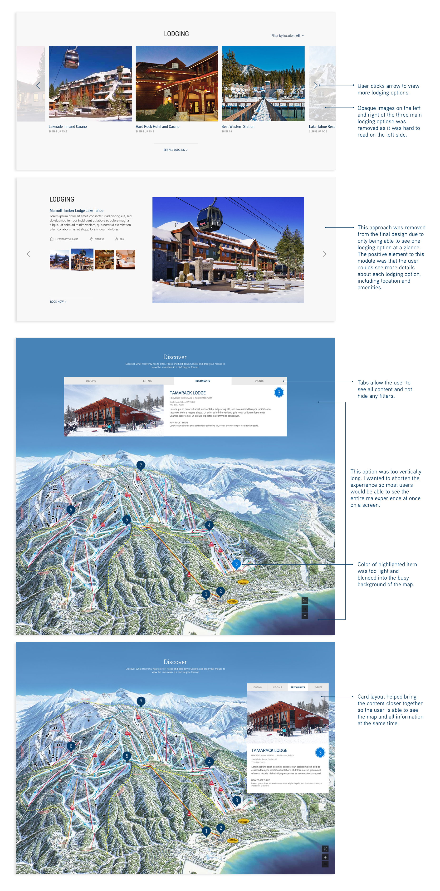
Interactive Discover
Instead of using a static map, I designed an interactive map so the user can get to know the mountain on their own terms. The user can click through lodging, rental areas, restaurants and events to see what the mountain has to offer. Once the user clicks a number icon on the map, its content appears on the right.