Microsoft Research Search
Improving content and user experience for Microsoft Research
Responsible for the full re-design of the Microsoft Research Search experience and ensuring users interact with search in a positive light.
My Role
UX Design Lead, Visual Designer, Content strategist
Timeline
3 months
TEAM
Myself, Microsoft Research stakeholders

Problem
Users struggled to find desired content. The card layout prevented users from viewing relevant search results and filtering UX needed to be stronger.
Challenges
Needed to create a better search functionality that displayed more results on the initial search page, along with a stronger filtering system.
Goals
Create consistent UX patterns and ease of use. I wanted the user to able to easily find the desired content within a huge database of results.

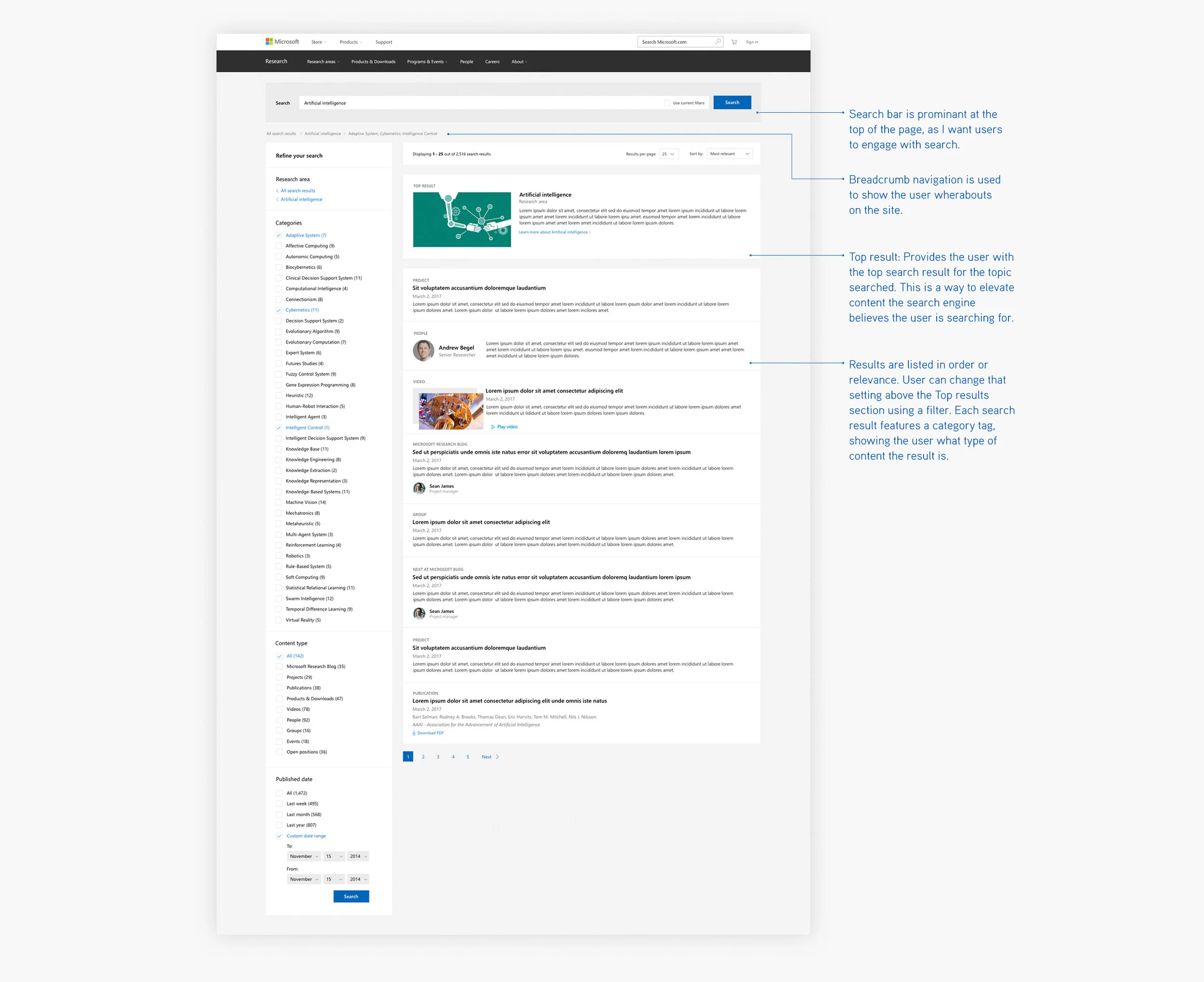
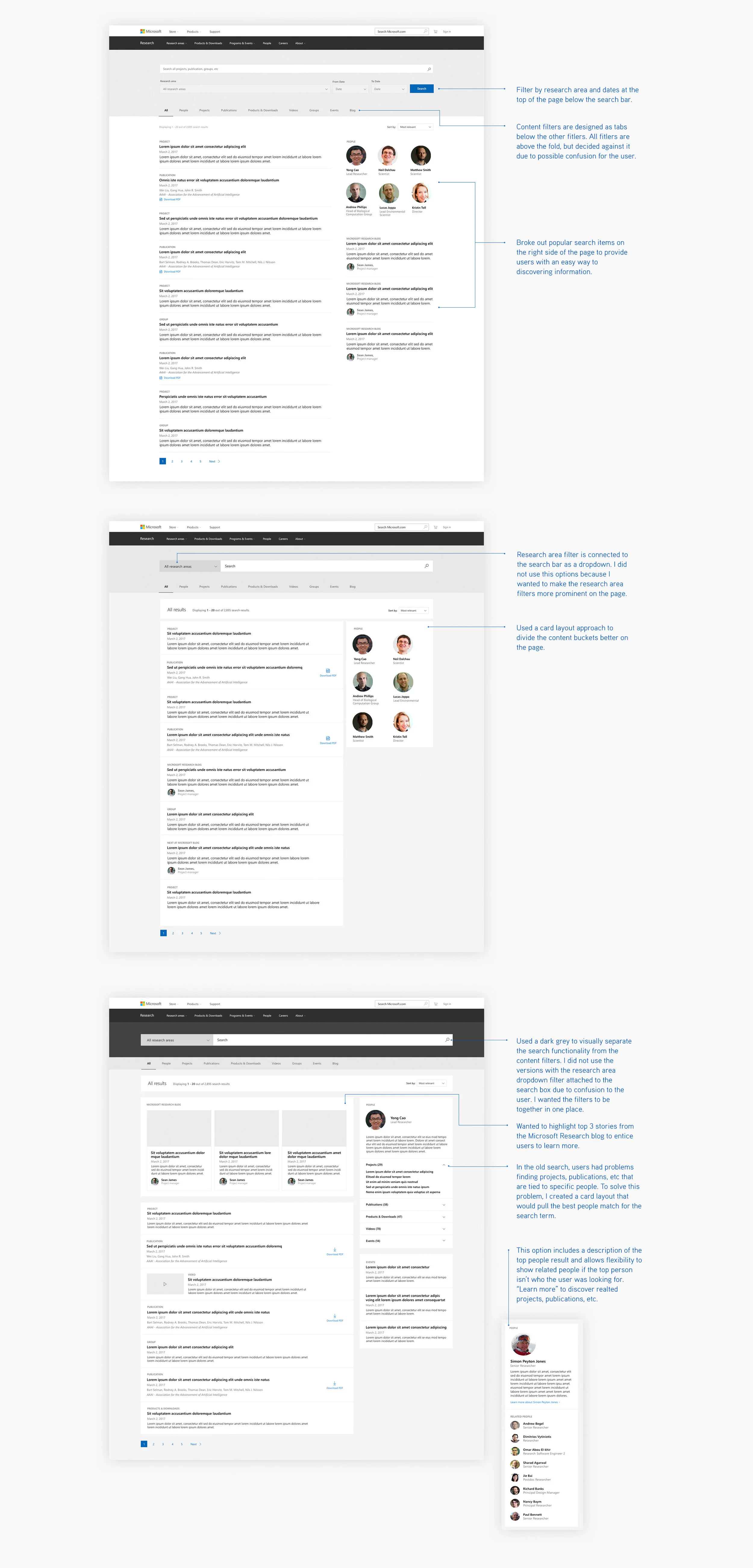
The biggest difference between the old and new design is the results layout. The old design was a long page where the user would interact with the left navigation to find desired content. It proved to be not as helpful as intended due to the card layout only allowing the user to view the top three results for each category.
Data-Driven Approach
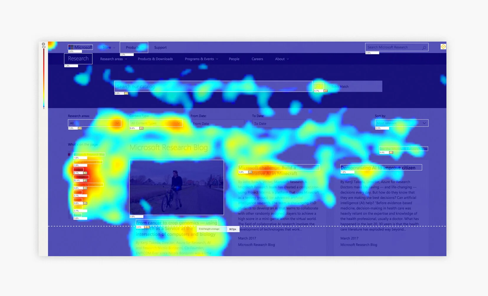
Heatmap Findings
Clicktale data showed users interacting with the "What's on the page" filters. Most users interacted with the current designs above the fold at 803px tall but displayed abandonment below the fold. Users interacted with the research areas and content type dropdowns to refine the search results the most.
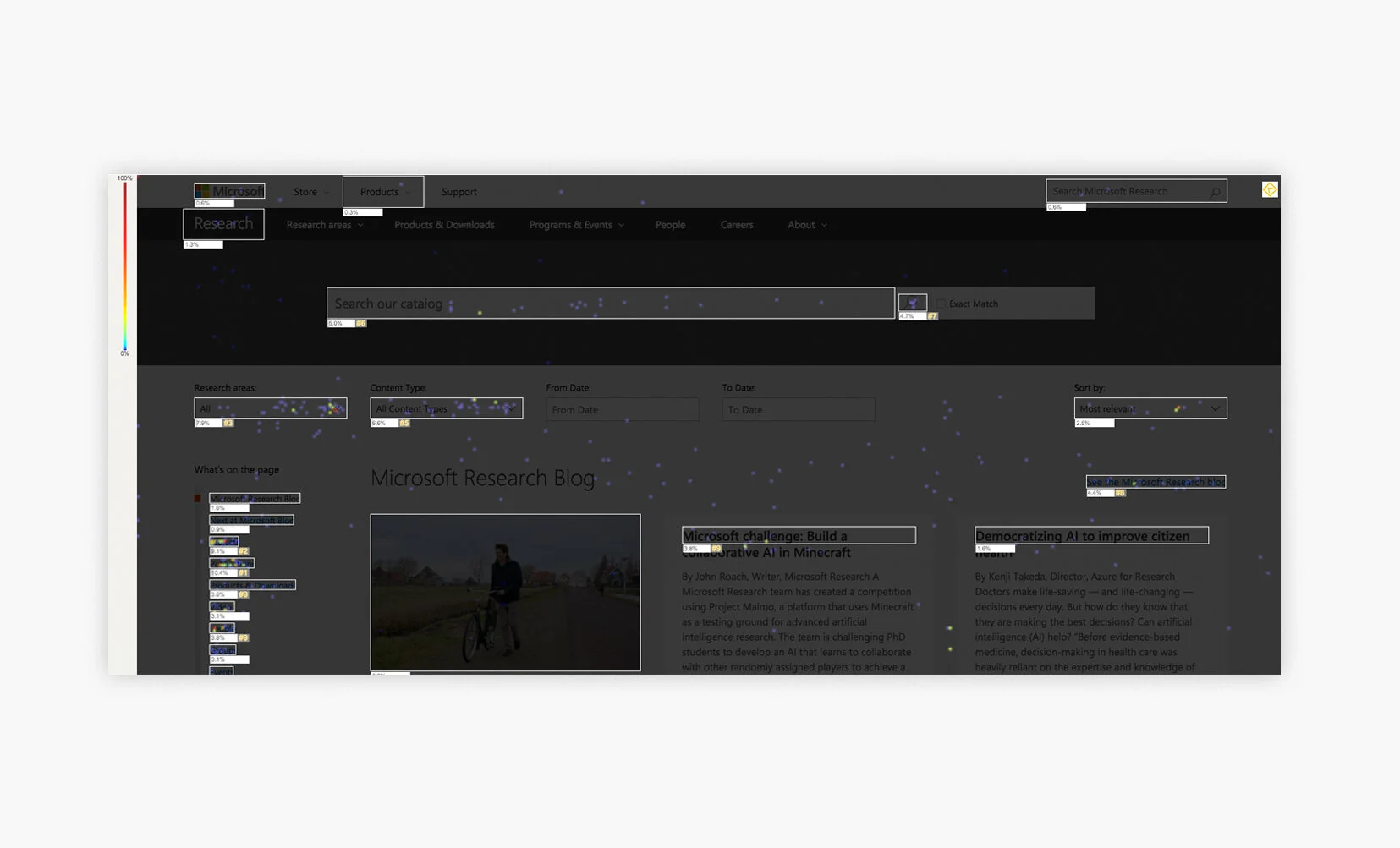
Click Findings
Clicktale data for mouse clicks showed that users heavily interacted with the research areas and content type dropdowns, proving they were the most important filters. There were high clicks on “See more”, meaning users cant find what they want on the page.
The Solution
Concise search results and a detailed filtering system on the left side of the page, where users can drill down to find the desired information. The search results design includes relative search terms with more information included in each result for scalability. A “Top result” section was designed to highlight what the user might be looking for.