Re-Imagining Checkout
Re-design of the T-Mobile checkout experience


My Role
Senior UX Designer, UX Lead; Visual Designer; Content Strategist
Company
T-Mobile
Timeline
2 months
Team
Myself, UX designer

Problem
60% of users were abandoning their carts in the legacy design. Addressing the problems in the checkout experience was crucial to improving this metric.
Goal
Simplify the checkout experience by removing common errors and confusion points, to increase checkout completion.
UX Solution
Simplify the process and remove barriers during checkout through industry best practices. The new UX design addressed all prior pain points, leading to 87% checkout completion.

Empathize
Meet the Users

First-time buyer
This is the customer’s first time through the buy flow. The goal is to empathize with the customer and provide them a simple and easy checkout process.

Hesitant buyer
This customer is focused on the numbers and is easily deterred by credit checks and changing payment totals. The goal is to make sure all payment amounts are explained clearly and to gain their trust.

Current customer
This is a current T-Mobile customer who is familiar with checkout, as they have done it before. The goal is to make it as easy as possible for them to check out by saving already-entered information and removing unnecessary steps.

Problems
Customers bouncing around within forms
Data showed that customer’s didn’t follow the form order while filling out forms. Instead, they bounced around on the page when entering in their information.
Mobile form fields
The mobile form fields needed to better encourage customers to fill in their information in the correct order. There were too many form fields at once on mobile.
Customers failing to move forward
57% of customers clicked on "Run credit check." Of those, only 36% eventually reached the Shipping & Payment page.
Customers going through the hard credit check twice
On mobile, 13% of customers who tried to “Run credit check” were going through twice, meaning they were clicking the CTA more than once. Only 5% were making it through “Run credit check.” It happened more frequently on mobile than on desktop.
Error states missing the mark
7% of customers had to try multiple times to pass through the credit check. On mobile, at least 10% of customers needed heavier hinting on missing or wrong inputs. They needed more indications about why they failed to move forward.
Residential address error messages
50% of customers encountered error messages associated with “Residential address,” causing fallout.

Solutions
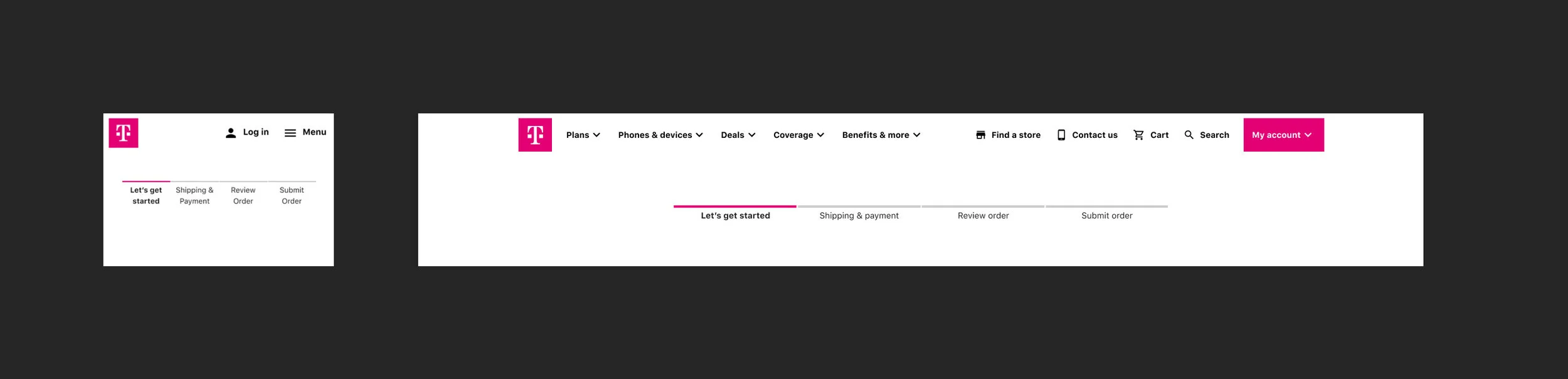
Progress Bar
We updated the progress bar to meet style guide changes and demonstrate the steps needed to complete the checkout process.
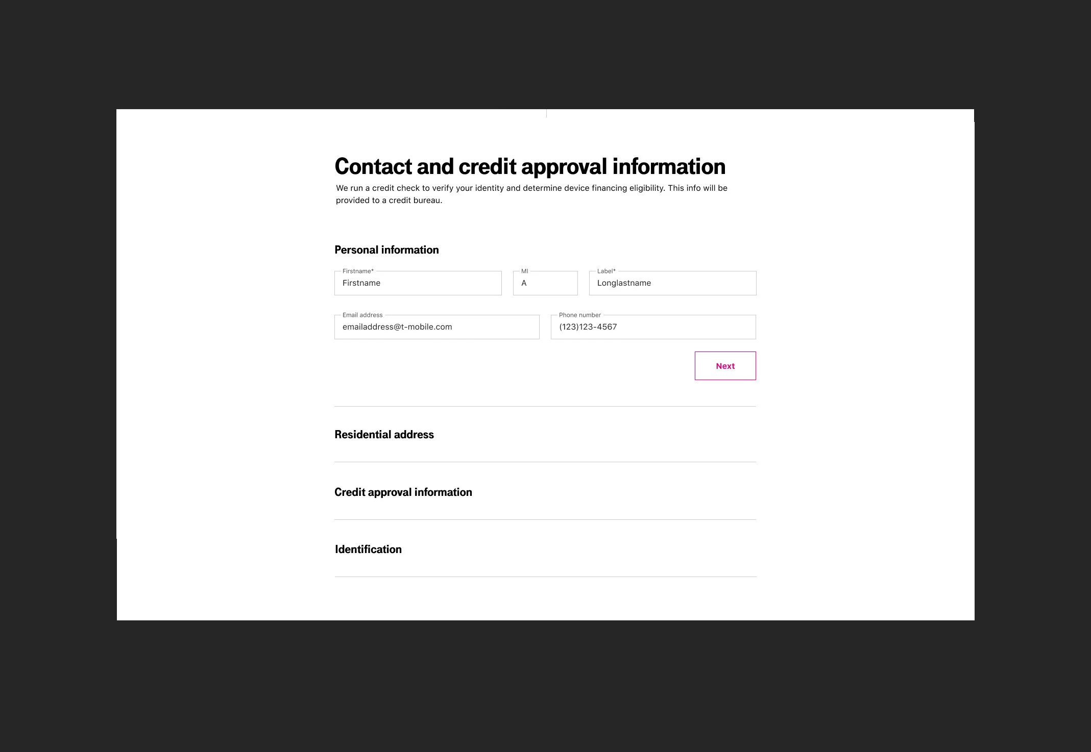

Form Field Organization
Our initial test presented all form fields on a single page, but results showed users frequently jumping between fields, leading to confusion. To improve the experience, we reorganized the form into steps, guiding users through the process in a more structured way.
In the checkout flow, users now see the first section open by default. Once all required information is entered, the “Next” CTA becomes active, enabling them to proceed to the following section. Each subsequent section remains collapsed until it is needed, encouraging users to complete the form in order. This approach significantly improved the user flow.

Auto-Suggest Address
Auto-suggest was implemented to optimize and reduce input errors during checkout for customers. When a customer selects an address, it is key that the address components are displayed as individual form fields. This makes it easier to verify the selected address. This also makes editing selected parts of the autofilled address easier, while reducing cognitive load.
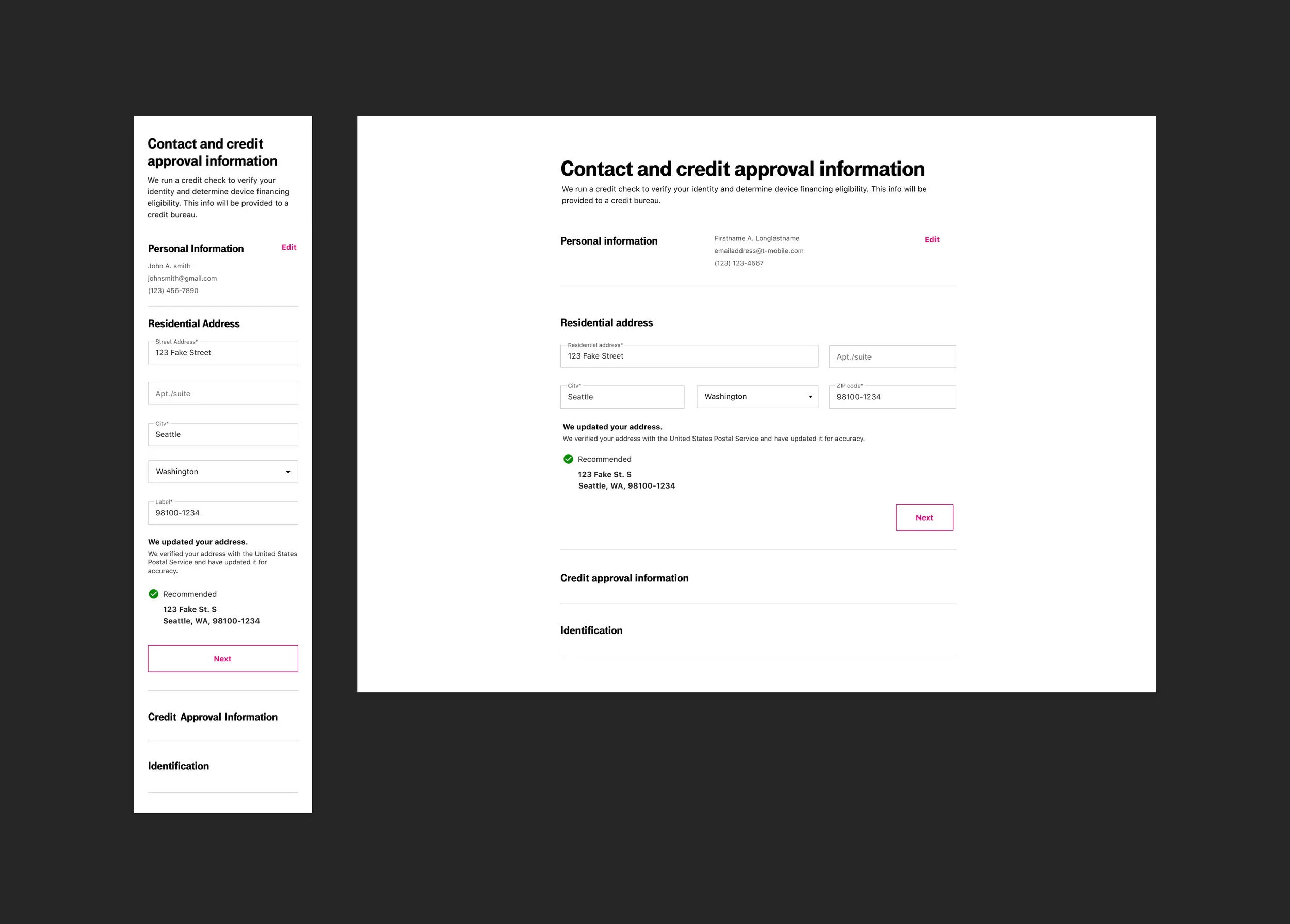
Address Verification
After the customer has entered their address, address verification was used to reduce the number of checkout errors, leading to increasing conversion rates.

Your Updated Payments
After customers successfully went through the hard credit check, their pricing would usually change due to their credit. Most users showed frustration through that process since they did not understand why their pricing changed. “Your updated payments” section was designed to be front and center where customers could easily see the changes.

Phone Recommendations
This section was designed to give customers other phone options that may not be as expensive. Because the main goal is to get the customer through checkout, we wanted to give customers other phone options that are cheaper.

Updated vs Original Payments
Customers wanted to know why their payments changed. Since pricing transparency is important, I ensured users could easily see that payment changes are based on credit history. If they didn’t complete the prescreen earlier, they may see different payments at checkout. To clarify past confusion, I used an expand/collapse design to compare payments.

Payments
Security plays a vital role for customers when checking out, especially in the payment section. I included the credit card trusted logo to reinforce the trust in the security of our checkout. This reduces customer fear and encourages a sense of security and control, leading to more finalized purchases. For current customers, we store their credit card information, making it easier for returning customers to make a purchase.
“Use shipping address for billing” maximizes efficiency and reduces extra input.

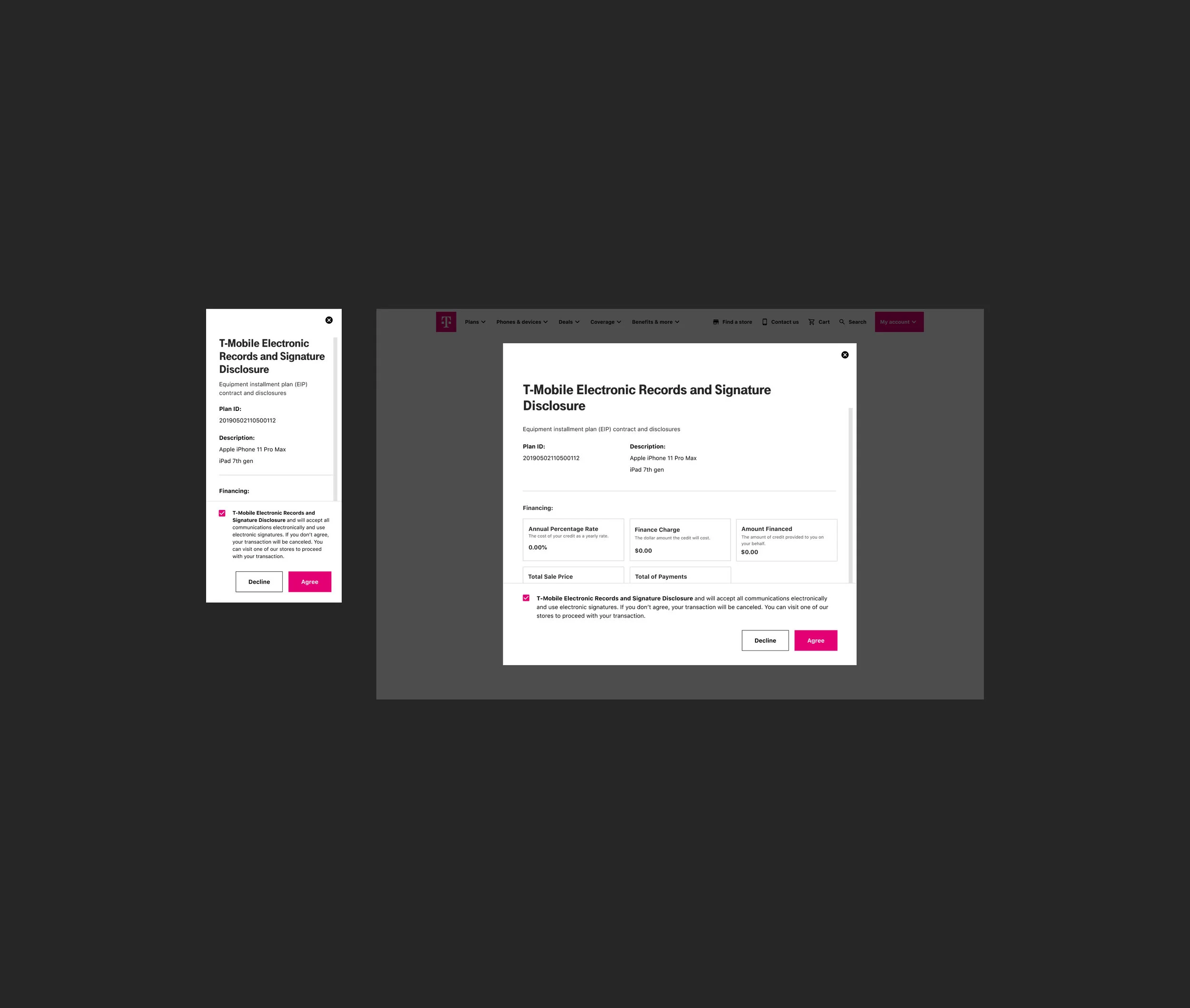

EIP Agreement
To read and sign the EIP agreement, customers were forced out of the checkout experience and into DocuSign. This caused a large amount of fallout and an interrupted experience. As a fast follower item, we were able to legally add the EIP agreement inline, providing the customer with a seamless experience. I designed the legally-required checkbox and CTAs to accept the agreement docked at the bottom of the modals for ease of use.


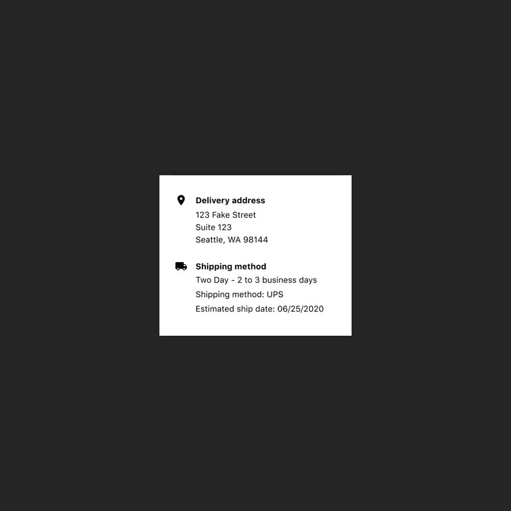
Ship
If the customer chose a shipping option on the Shipping & Payment page, they are given the delivery address and shipping method.
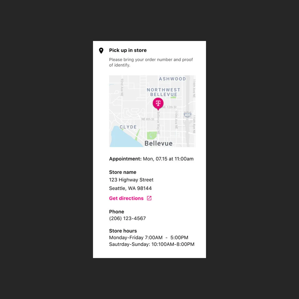
Pick Up
If the customer chose to pick up their order, I included a map for the store’s location, their appointment time, store address and all store information. They have previously chosen their appointment time prior to submitting their order.
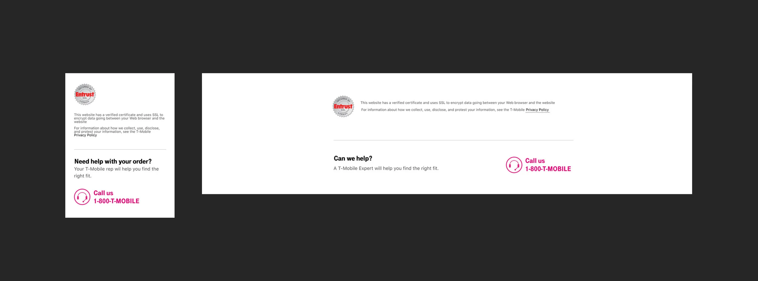
Entrust Logo & Chat
Our Entrust logo appears at the bottom of every page as well as a live number for chat. Displaying trust signals and a chat opportunity can reassure customers and help remove any lingering doubts throughout the checkout process.

Order Status
Order status provides the customer with a clear status of their order. Once the order is delivered, we provide a way to connect with T-Mobile by downloading out apps on their new devices. Order status has many different views to account for all use cases.
Problems that were solved

Improved Form Navigation on Mobile and Desktop
Post-launch data shows that customers concentrate better on each part of the checkout process. By allowing only one section to expand at a time, we have lowered mental effort and reduced distractions.

Mobile interaction
Customers successfully completed each form section and smoothly progressed to the next, ensuring a streamlined mobile experience.

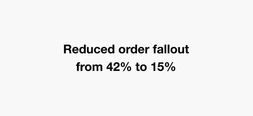
Increased Completion Rates
Post-launch analysis shows a significant decrease in order fallout, with the new design reducing the dropout rate from 42% to 15%, compared to the legacy design..

Prominent and Specific Error States
Clear error messages were added to help customers fix missing or wrong inputs. These visible errors provide better feedback, making it easier for users to understand why they can’t continue.

Fewer Residential Address Errors
With the new auto-suggestion feature for addresses, customers are experiencing fewer interruptions from error messages, improving the overall experience.

Descriptive CTA’s
Descriptive CTAs were added to clarify the next step, fostering customer confidence and trust throughout the process.

Order Review Engagement
78% of customers interacted with the “Review Order” page during checkout, confirming the importance of providing a summary before finalizing the order.

Order Status
The order status feature gives users helpful delivery updates and chances to connect with T-Mobile, whether they are new or existing customers.