T-Mobile Cart Experience
Re-design of the T-Mobile shopping cart experience
My Role
Senior UX Designer, UX Lead; Visual Designer; Content Strategist
Company
T-Mobile
Timeline
3 months
Internal Stakeholders
Business Strategists and Product Development teams
Problems
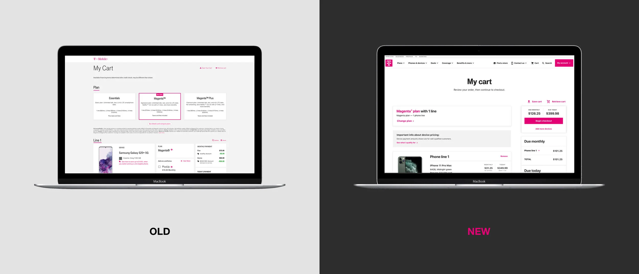
The legacy checkout experience was experiencing a high volume of cart abandonment. Customers struggled to find and understand payments, how to change their plan, add device protection, and more. The look and feel was not cohesive between steps, adding to customer confusion.
Goals
I sought to create a mobile-first cart that simplified the customer's experience and cognitive load. As the owner of these goals, my goal was to create a clear pathway for plan selection, payment explanations & totals, promotions and discounts, while gaining the customer’s trust.
UX Considerations
Addressing the pain points from the legacy cart experience was my primary focus during the MVP launch. I focused on a variety of issues on a tight timeline, while also navigating restrictive functionalities, and looking for new opportunities to simplify the customer's experience.
Empathize
Meet the Users
The Pricing-Focused Customer
This customer wants to make sure all pricing is correct and that they understand each charge and what it correlates to. They will review all items line-by-line before they proceed to checkout.
The Skimmer
This customer skims through the cart, assuming the math has been done for them correctly. They will skim through the devices and plans, making sure their information is correct before they proceed to checkout.
Define
Narrowing in on the Problems
Lack of Holistic Cost Breakdown
Customers had difficulty finding a clear overall price breakdown. Each device had separate pricing, forcing customers to manually calculate the total charges.
Inaccurate Pricing
Pricing displayed for well-qualified customers often differed from final checkout prices if the customer didn’t undergo prescreening, causing confusion and potential abandonment.
Promotions Not Displayed
Promotions like “Buy One Get One” weren’t accurately shown in the cart, leaving customers unsure if they were receiving the offer.
Inability to Change Plans
Customers couldn’t change their selected plan in the cart, despite the UX suggesting otherwise, leading to confusion.
Confusing Add-ons & Extras
The add-ons and extras section in the device card wasn’t clearly distinguished, leading to confusion.
Device Cards Lacked UX Hierarchy
The device card contained too many options, causing confusion about where to find specific information.
Ideate
Explorations
Layout
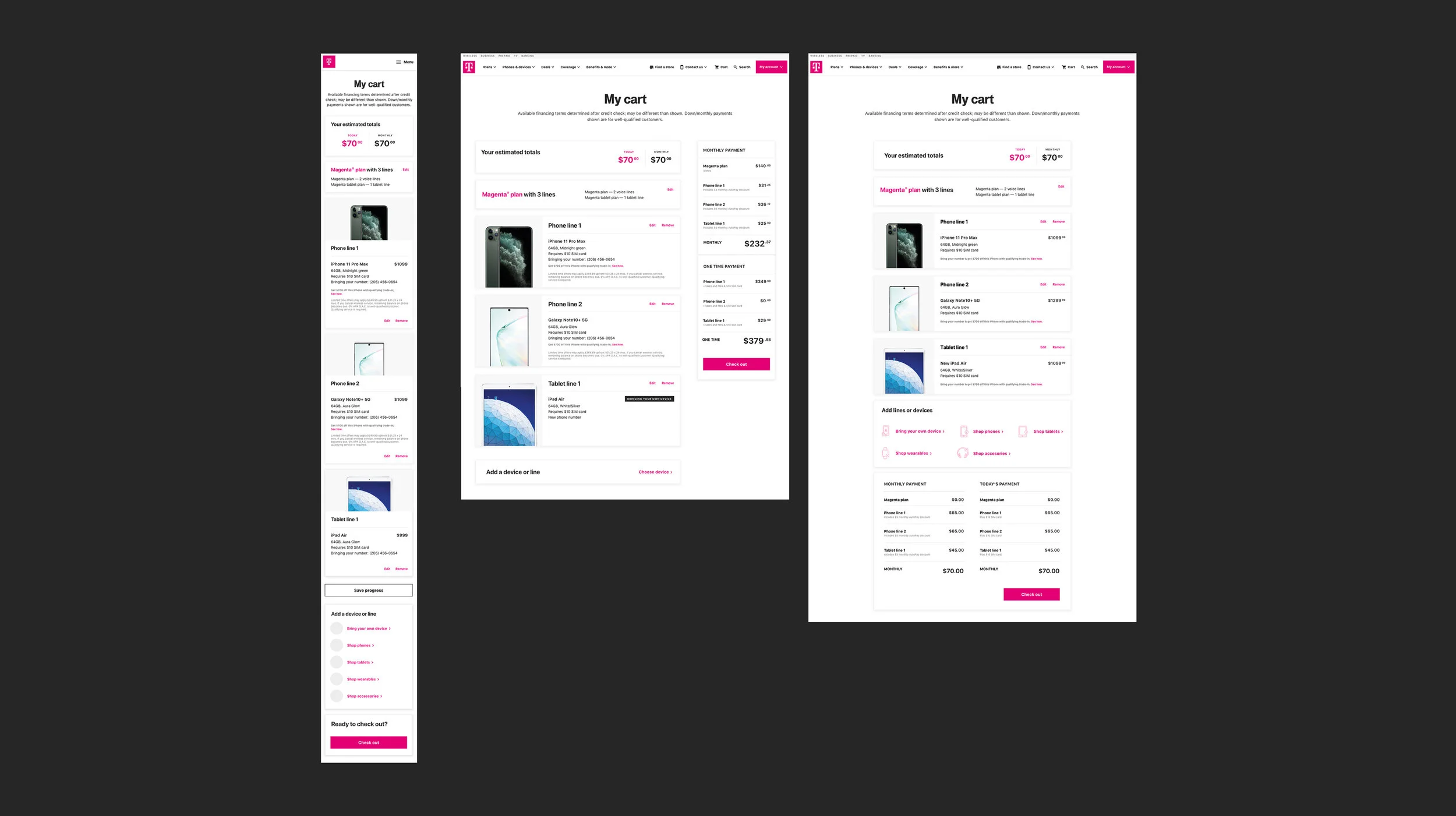
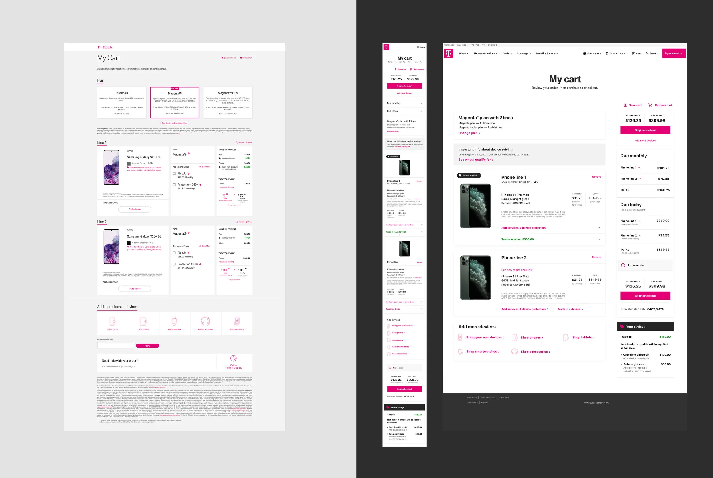
I began my process with light wireframes to the layout page. After exploring all options using competitive analysis and benchmark studies, I landed on using a right rail for all pricing so this information remained in a consistent place. This layout is a proven industry standard, and one that customers are familiar with, thus reducing their cognitive load.
Cart Explorations
In the updated cart, customers have the ability to change their plan while in the process of checking out. Post launch, data showed that customers understood what the CTA would do.
Device Cards & Promotions
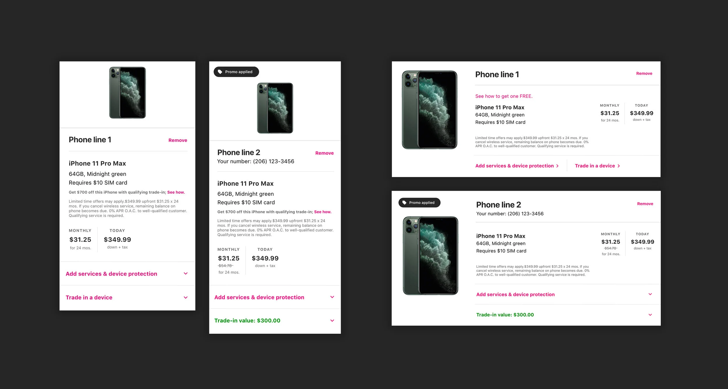
Taking a mobile-first approach, I designed the device cards to have a clear hierarchy, housing only device information. The MVP launch had to include add ons, device protection and trade-in at the bottom of the device card. I am leading the initiative and designs to have those items in the upper funnel of the purchase flow, as initially intended.
Right Rail Pricing
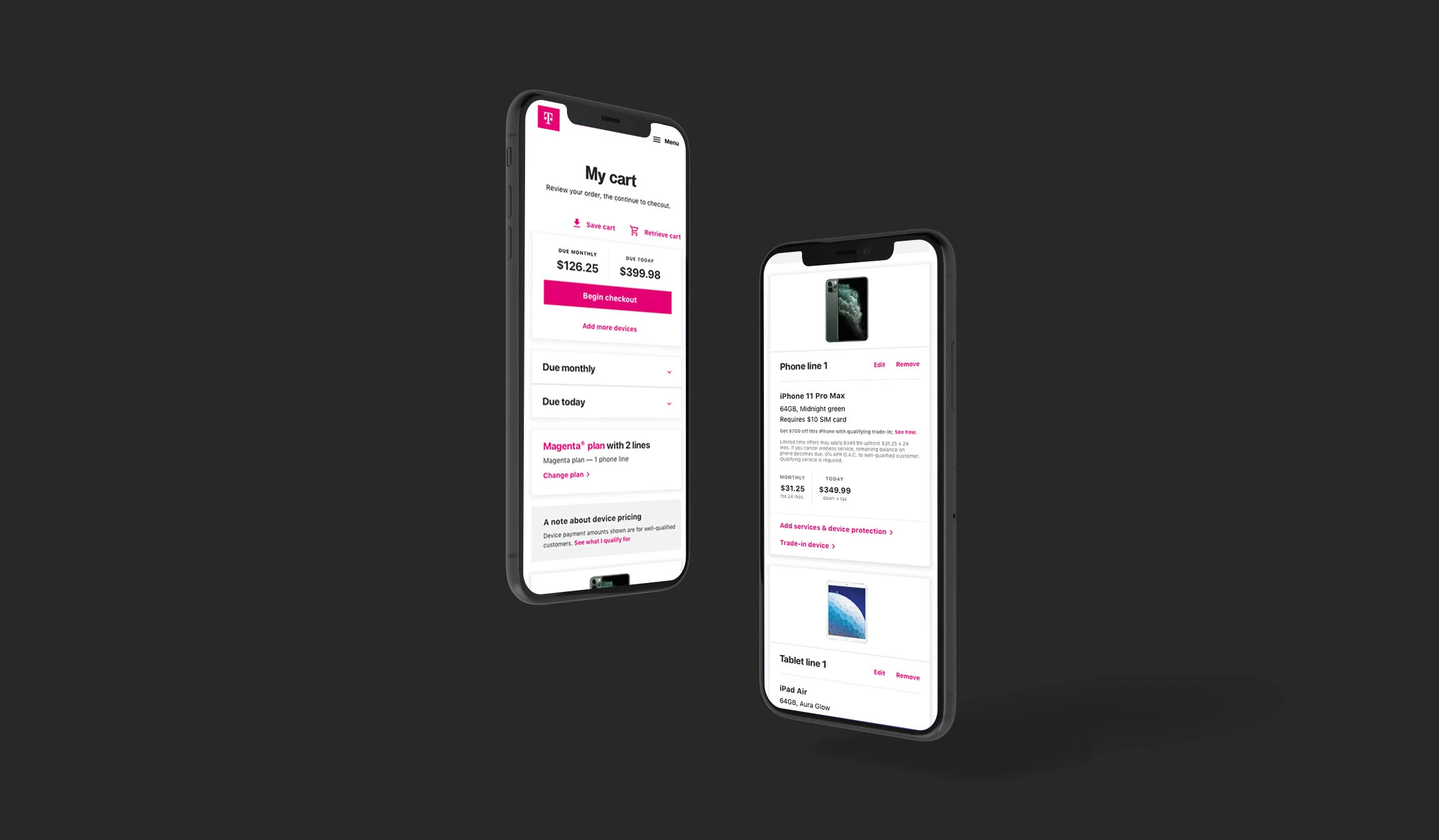
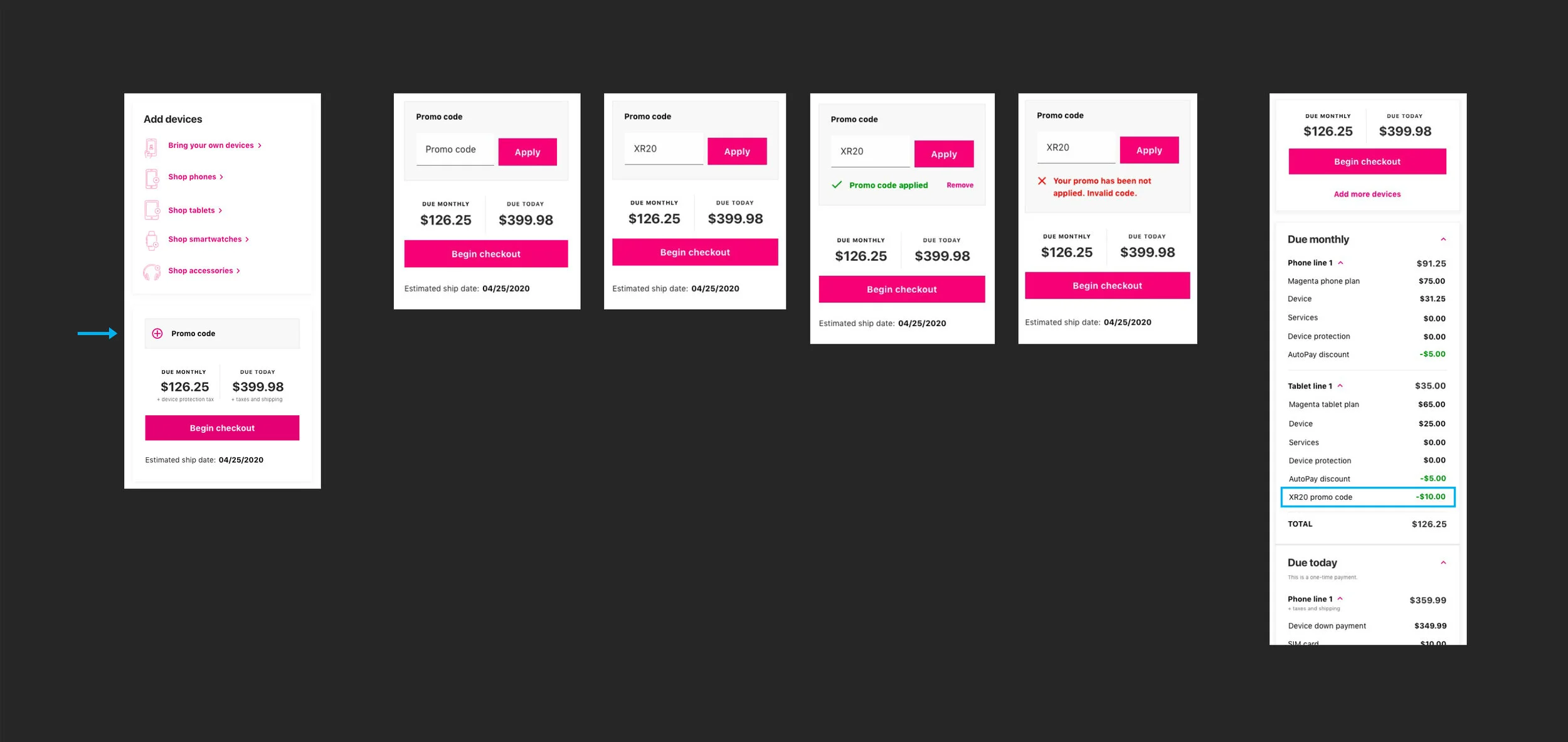
The mobile version now features an expand/collapse design that allows customers to interact with pricing without sacrificing mobile page length. It is fully responsive and allows customers the flexibility to focus on specific pricing details, reducing cognitive load.
Promo Code
The promotion code section in the legacy cart was hard to find. I designed the new promotion section to be discoverable, located above the final pricing.
Total Savings
The “Your savings” module provides a way for customers to know when and how they will receive their promotions and discounts. Post launch, there has been over 65% of an increase to order conversion, meaning that over 65% of people who see the trade in promotion pricing breakdown place an order.
Promotions
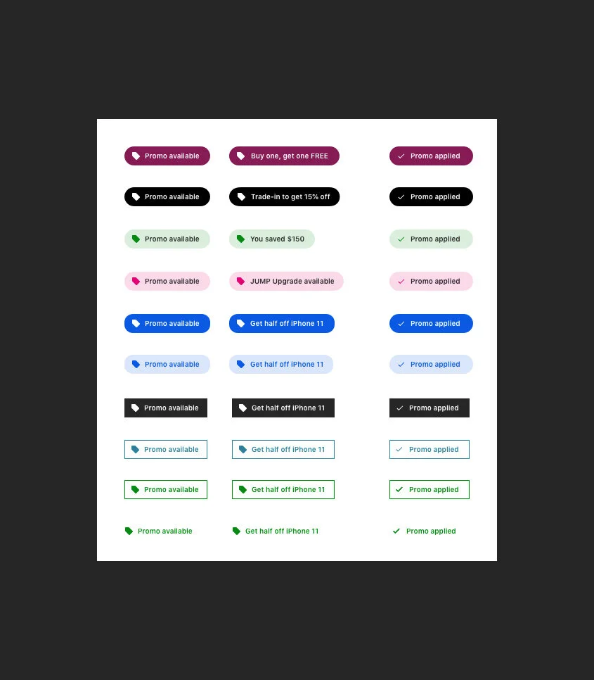
Partnering with another Sr. UX designer, we worked to design the most usable promo callout within the purchase flow and cart. We landed on the black pill box to ensure our customers would notice the promo inclusion (listed second example from the top).
Solutions
End Result
The End product was designed as a mobile-first experience. 64% of customers interact with the cart on their mobile device.


